The Emotional Color Wheel: How to Make Any Performance Real
Tell an actor to “be sad” and watch what happens. They drop their shoulders, lower their voice, maybe summon a single all-purpose grief, and the result is a flat, generic sadness that no real human has ever actually felt. The direction was the problem. “Sad” is too big and too vague to play, the way “make it good” is too vague to be a useful note. What an actor needs is a handle small enough to actually grab.
That handle is a color. When you assign a feeling a color, it stops being an abstract idea and becomes something you can see, mix, and dial up or down. This tool borrows its structure from the psychologist Robert Plutchik, who mapped human emotion as a wheel, and I want to credit him plainly, because some of the most useful things I teach about the voice did not come from the voice world at all. Plutchik did the hard thinking. I just turned it into colors a seven-year-old and a working actor can both use.
Once you can name the color, you can paint with it. And real emotion, like a real sunset, is never just one.
Want to work with me one-on-one?
The wheel, in colors
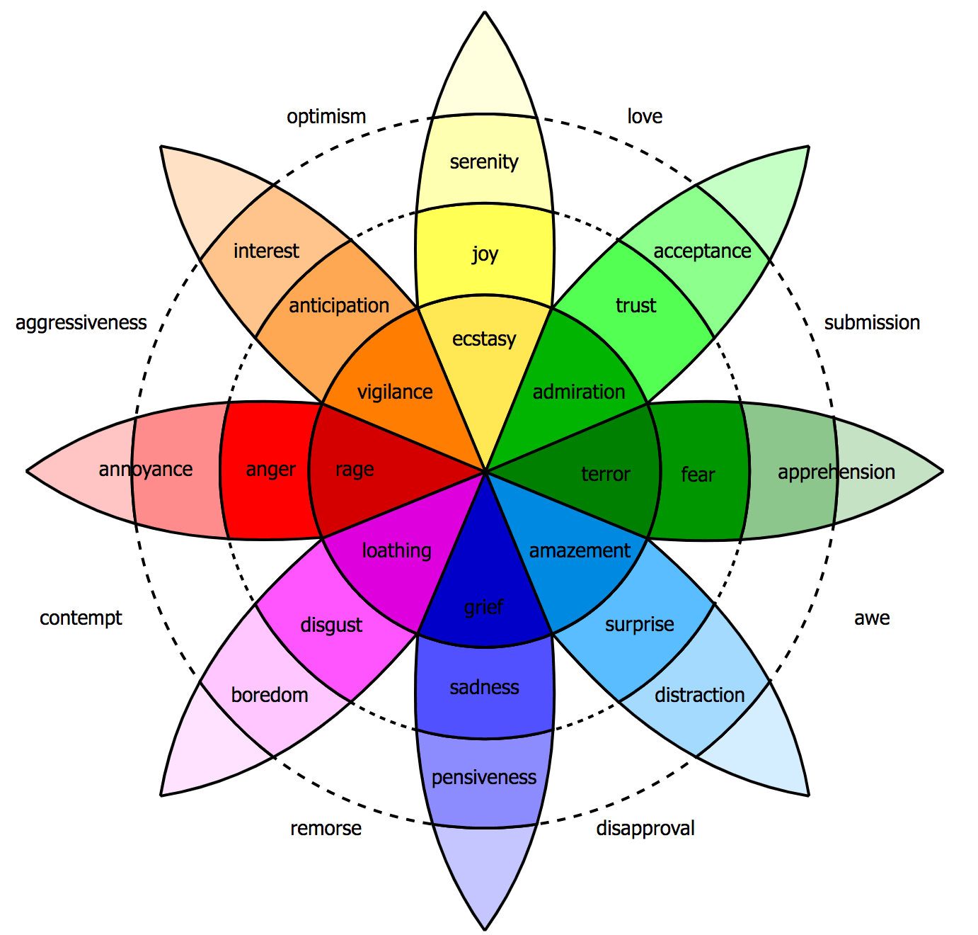
Start with the primaries, the basic emotions everything else is built from. Assign each one a color so you can hold it in your mind at a glance.
• Red is anger.
• Blue is sadness.
• Yellow is joy.
• Green is fear.
• Light blue is surprise.
• Purple is disgust.
These are the building blocks. The point of naming them by color is not to be cute; it is that a color is genuinely easier to play than a concept. A color steers your pitch, your pace, your energy, and your body all at once, without you having to intellectualize the feeling. Tell yourself “red” and your whole instrument tilts toward anger more honestly than if you sat there trying to think your way into being angry.
Intensity lives at the center
Here is the part of the wheel that does the most work. Each color runs from intense at the center to subtle at the outer edge. Move toward the middle and the emotion gets stronger; move toward the rim and it softens into something everyday.
Red is the clearest example. At the blazing center, red is rage, the full-body, see-nothing-else version. Slide outward and it becomes ordinary anger. Keep going to the rim and it cools to mild annoyance, the feeling of a slow website or a sock with a hole in it. Same color, three very different intensities, and an actor who can find all three has a far more precise control than one who only has “angry.”
This solves the most common over-acting problem in one stroke. Performers tend to play everything at the center, every emotion cranked to its most intense version, which reads as melodrama. Most of real life happens out toward the rim, in the subtle shades, and knowing you can place an emotion anywhere along that line from center to edge is what makes a performance feel true instead of operatic.
Real emotion is layered
Now the most important idea, and the one that separates believable acting from the cardboard kind. Real people almost never feel one pure emotion. They feel several at once, blended, the way a sunset is never a single color.
I live in Arizona, where the sunsets are genuinely absurd. Picture commissioning a painter for a serious sum to capture one of them, and the painter hands you a canvas that is entirely orange. You would be furious, because that is not what you saw. A real Arizona sunset has orange and pink and purple and gold and a bruised blue at the edges, all at once, and that combination is the entire reason it stops you in your tracks. A real emotion is the same. Paint it in one flat color and you have technically named the feeling and completely missed it.
The wheel handles blends directly. Combine two primaries and you get the complex emotions. Anger and disgust together, red and purple, give you contempt, which is a different and more specific thing than either one alone. The famous observation that love and hate are two sides of the same coin is really a statement about adjacent and blended colors on the wheel. The complex feelings that actually move an audience are mixtures, and the wheel gives you a way to build them on purpose instead of hoping you stumble into them.
Reading the neighbors and the opposites
Part of what makes the wheel a map and not just a list is that the colors have positions relative to one another, and those positions are useful. Emotions that sit next to each other on the wheel blend easily and often shade into one another; emotions across from each other create the sharpest contrast.
The neighbors explain why certain feelings live so close that one keeps leaking into the other. Anger and sadness sit near enough that a grieving person flares into rage and a furious person suddenly chokes up, which is why a red read with a thread of blue underneath feels so human. Joy and trust sit together, which is why warmth and openness tend to arrive as a pair. Knowing the neighbors lets you build believable transitions, sliding from one color to an adjacent one the way real feeling actually moves, rather than cutting hard between unrelated states.
The opposites give you your strongest dramatic contrast. A moment of joy lands hardest right after sorrow; fear reads sharpest against a beat of calm. When you want a feeling to hit, set it against its opposite a moment earlier, the same way the loud only lands after the quiet. Reading the wheel this way turns a static palette into a sense of motion: you are not just naming colors, you are charting a path through them, and the path is where the emotional life of a performance actually lives.
For film, TV, and stage actors
This is the tool’s home turf, and the practical move is to map a monologue beat by beat in colors. Do not decide the speech is “angry” and play red for two minutes. Go through it and find where the color shifts and, more importantly, where colors layer.
A speech might run mostly blue, grief, with a thread of red anger underneath, and a splash of purple disgust at one specific line. Naming that mixture gives you something concrete to play in each moment, and it keeps the performance from flattening into one note. Decide your intensity too: is this blue out at the rim, a quiet ache, or blue near the center, open weeping? The combination of which colors, in what proportions, at what intensity, is essentially a recipe for a believable emotional life, and it makes your choices repeatable from take to take and night to night.
For voice actors
In an audition, you frequently get one line and a handful of takes to show range, and the color wheel is the fastest way to generate genuinely different options. Spin the wheel. Give them the same line in three different colors and let them choose.
The neighbors on the wheel are especially useful here, because some emotions sit surprisingly close together. Anger and sadness, red and blue, are nearer than people expect, and a line delivered with one often has a shadow of the other. A read that is angry on the surface with blue grief underneath is far more interesting than pure red, and it gives a casting director a reason to remember you. Because all of this lives in your voice alone, layering two colors into a single read is your entire craft, and the wheel makes that layering deliberate rather than accidental.
For singers
A lyric is an emotional script, and singers fall into the same trap as actors: they pick one mood and ride it through the whole song. Color a song the way an actor colors a monologue, verse by verse, and you turn a pretty performance into a moving one.
A verse might be yellow joy shading into blue as a memory turns bittersweet, then lifting back toward yellow in the final chorus. The notes do not change, but the color underneath them does, and the audience feels the difference even if they could not name it. This is the gap between a technically lovely rendition and one that makes people cry. Same pitches, same words, layered colors instead of one flat wash.
For speakers
Speakers need the wheel with a lighter touch, because a leader painting every shade of emotion across a keynote looks unstable, not compelling. The move for a speaker is usually to find the one true color underneath the story and let it show, honestly, rather than performing a whole palette.
If you are telling a story about a setback, there is probably real blue in it, and maybe a thread of yellow in how it resolved. You do not need to act that out. You need to locate it truthfully and let a genuine shade of it color your voice, so the audience senses a real person rather than a polished delivery. One honest color, well placed, does more for a speaker than a dozen performed ones.
Start painting this week
The color wheel turns the vaguest, most frustrating direction in performance, “feel something real,” into a concrete and playable craft. Name the color, set its intensity, and layer it with another, and you can build emotion as deliberately as a painter mixes a sunset.
This week, take one monologue, one lyric, or one story you tell, and color it. Mark where the colors shift and where two of them overlap, and decide for each moment whether you are near the intense center or the subtle rim. Then perform the mixture instead of a single flat feeling, and credit Mr. Plutchik quietly while you do it. He gave us the map; your only job is to pick up the brush and paint. You will find that “be sad” was never the assignment. Painting the whole sunset is.
ABOUT THE AUTHOR

Topher Keene is a featured soloist with the Boston Symphony Orchestra and a Grammy-Award Finalist whose coaching draws freely from psychology, pedagogy, and performance. A member of Mensa and the Triple Nine Society, he has spent more than two decades helping actors, singers, and speakers make their work ring true, teaching from Phoenix, Arizona and with students across the world.
Want to work with me one-on-one?
Looking for more?